Sunday, 24 November 2013

The Architect and the Painter

Following Alvar Aalto’s discoveries were the couple, Ray and Charles Eames. Charles came from an architectural background whilst Ray came from a background of painting and weaving as well as the new developing Abstract expressionism. They travelled to Europe and were both exposed to the works of the Modern Movement, Mies van der Rohe, Le Corbusier and Gropius.

Their breakthrough was when they won the Organic Design in home furnishings Competition which was held at the Museum of Modern Art New York in 1940. This competition sought new contemporary forms of home furnishings, upholstery and related items. The winners were Eames and Eero Saarinen who had collaborated to form an organic curved wooden shell chair that united beauty with comfort. It was a new idea of design in contrast with the harsh, geometric forms which were being seen at the moment of the Industrial Style, and it was that factor which made them win the competition.

The discoveries made by Ray and Charles Eames in the bending of wood got them a commission from the US Navy to develop plywood splints, stretchers and glider shells which were moulded by heat and high pressure. Their revolutionary proposals were state of the art in manufacturing technique, firstly the moulding of plywood into complex curves and also the use of cycle welding which enables metal and wood to be joined by the electronic bonding process. At this time there were a lot of advancements in technology which made these techniques possible. Such example could be seen in:

Plywood splints commissioned by US Navy

CTW table and screen and LCW plywood chair


They did not only produce furniture and necessities needed by the war but also children’s toys and they used the same techniques which made these works immediately recognisable as Eames creations. The fact that they were making use of bent wood it made their products strong even though they had a light weight appearance to them.

In early 1940’s Charles Eames used to work for MGM in creating movie sets and also working with his wife in creating and developing the Kazam machine. It was the machine that made all their creations possible. Although in early designs they had to split the wood at specific points so that the mould would not burst.

 
The Kazam Machine and Chair Shell Experiments, designed 1941-45, moulded plywood, metal, and rubber.

Once they had mastered the moulding technique Ray and Charles Eames moved onto another material thus created the fibreglass moulded chairs series. This way they had provided a universal seat shell that could be mass produced therefore it was cheaper to the consumer and it could be applied to a variety of bases. Their designs were so innovative that we still see them in today.

Eames plastic shell chair with various bases 1948-1950.

Eames Wire Mesh Chair 1951-1953.

Plastic Mould of La Chaise 1948.

Today we consider these designs as elegant and a sense of style in which whoever has one wants to show a statement of lifestyle and living. I am not talking about only the Eames chairs but also other innovative designs such as Arne Jacobsen’s famous Egg and Swan Chair. Said designs often go unnoticed when we watch a movie because they still blend well with our present lifestyle and are ageless due to their organic forms. So I did some research about these designs so that I can point out in which movies they were shown, but the list was much longer than I expected when I came across Anne-Sophie’s blog in which she gives a detailed analysis. This blog can be found at: http://www.retrofurnish.com/blog/en/2012/08/design-in-movies-week-2/

Some examples consist of:

Eero Saarinen’s Eero Chair which is a reminiscent of the chair by which he had won the MOMA competition with Charles Eames but this time it is more refined, with more padding and the use of chrome for the legs.
We also have the Pedestal Chair which was innovative in its own way. This was due to the fact that it was produced to have one base instead of four legs which gave a sense of lightness.


These two stylish chairs are the Swan and Egg Chairs 1957-1958 by Arne Jacobsen which were created as a whole with the Arne Jacobsen Royal Hotel Copenhagen 1956-1960. 


These are the Panton Chair 1960 and Cone Chair 1958 by Verner Panton.


Vitra Design Museum. UN. Organic Armchair Charles Eames and Eero Saarinen [online] Available at: http://www.design-museum.de/en/collection/100-masterpieces/detailseiten/organic-armchair-charles-eames-und-eero-saarinen.html [Accessed on 23rd November 2013]

 Herman Miller. Design Story.[online] Available at: http://www.hermanmiller.com/products/seating/multi-use-guest-chairs/eames-molded-plywood-chairs.html [Accessed on 23rd November 2013]

Tom. April 2013. Miniature Chair Man: Charles and Ray Eames - Time-Life stools [online] Available at: http://www.miniaturechairman.com/8/category/charles%20and%20ray%20eames/1.html [Accessed on 23rd November 2013]

Anne-Sophie. August 2012. Design in Movies: week 2. [online] Available at: http://www.retrofurnish.com/blog/en/2012/08/design-in-movies-week-2/ [Accessed on 23rd November 2013]

Tuesday, 19 November 2013

Humanising Approach to Design

The term for International Style was first used in 1932 by Henry-Russell Hitchcock and Philip Johnson in their essay titled The International Style: Architecture Since 1922. So instead it got its name from a poster like Art Nouveau and Art Deco did, this got its name from a catalogue for an architectural exhibition at the Museum of Modern Art. The International style is mainly characterised by the works of Frank Lloyd Wright and Walter Gropius by their use of rectilinear forms, light, plane surfaces that have been stripped of any ornamentation, the use of open interior spaces and the fact that the buildings have a sense of weightless quality due to the use of reinforced-concrete cantilever slabs. Other characteristics are the combination of simple and natural materials with modern building materials, such as glass and concrete with wood and stone. 


Even furniture was to be free of ornamentation and had to imply clarity, transparency, elegance and rationality. But apart from the Architectural design we also have the Organic Design of International design. The humanizing approach to design was first pioneered by Charles Rennie Mackintosh. Frank Loyd Wright continued to work on these ideals. Their principle was the unity of the whole total effect matters more than the sum of all the parts. A building had to capture the spirit of nature and the interiors were made to connect with the architecture. Architecture was made to connect with its surrounding nature although organic forms were seldom used.

An important designer we find in the Organic Design of International Design is Alvar Aalto who studied architecture in Helsinki, then travelled to Europe and Scandinavia. His travels, as well as his homeland, are going to influence his designs and his way of thinking. Aalto started to experiment with the bending of wood which later led to his revolutionary chair designs which also inspired other designers such as Ray and Charles Eames.  His belief was that natural materials fulfilled the functional and psychological needs of users.

One of Alvar Aalto’s 1930s plywood experiments.

He also designed his house in Turku in 1927 which was regarded as the first example of Scandinavian Modernism.


Although it is constructed using geometric shapes it is still considered as organic since it blends with the surroundings. Even the materials and colours blend with its surrounding nature.

Chair by Alvar Aalto, Model 31, in comparison with the Red and Blue Chair by Gerrit Rietveld. Both are following the same principles, that of simplistic in form and without decorations. But in Aalto’s design we get more curves of the wood and only done in two parts, rather than the angular multiple pieces of Rietveld design.

Alvar Aalto iittala vase

Alvar Aalto Stackable Stool

Aalto pioneered a humanizing and modern organic vocabulary of form, with soft flowing curves instead of rigid formalism. His main concern was both the functional and emotional impact his products had on the consumer rather than the possibility of universal transcendence.

Encyclopædia Britannica. 2013. Encyclopaedia Britannica: International style. [online] Available at: http://www.britannica.com/EBchecked/topic/291280/International-Style [Accessed on 16th November 2013]

Hauffer T. 1998.design a concise history. London. Laurence King Publishing.

Simon Glynn 1999 (updated 2004). Walter Gropius House, Lincoln MA. [online] Available at: http://www.galinsky.com/buildings/gropiushouse/  [Accessed on 16th November 2013]

The Little House Window design. 1998. Wright on the Web: Seventeen Buildings by Frank Lloyd Wright. [online] Available at: http://www.wrightontheweb.net/flw8.htm [Accessed on 16th November 2013]

UN. Design Museum: Plywood. [online] Available at: http://designmuseum.org/design/plywood  [Accessed on 16th November 2013]

Auctionata: Chair by Alvar Aalto, Model 31. [online] Available at: http://auctionata.com/en/o/28572/chair-by-alvar-aalto-model-31-around-1930  [Accessed on 16th November 2013]

Scherer Marton. March 2013. Debu: A design nagymesterei – Alvar Aalto [online] Available at: http://www.designbutorok.hu/a-design-nagymesterei-alvar-aalto/  [Accessed on 16th November 2013] 

The Reunification of all the Artistic Handwork Disciples

The Bauhaus didn’t just come to be, but rather progressed from other previous movements that lead to it. For instance, the Arts and Crafts movement together with Constructivism, De Stijl and Deutsche Werkbund were the founding movements which lead to the Bauhaus Movement. I already discussed these said movements individually about their foundations and principles. Now we are going to see how each contributed to make the Bauhaus Movement possible.

Being modern means making use of new technologies and techniques, as did the Impressionists at that time. With regards to design, the fact that we went through the Industrial Revolution and mass production, makes it modern. Therefore anything which is new and innovative is by definition modern!

The Bauhaus was founded in 1919 by Walter Gropius in 1919, by uniting the Weimar Art Acadamy and Henry van de Velde’s schoolof Industrial design. Its name meant literally building house. It was initially moved to Dessau then to Berlin but it was eventually closed down in 1933 by the Nazis. Later the Bauhaus moved to America but it did not last long there. “The Bauhaus’ attempts to gather all artistic creation into a single entity – the reunification of all the artistic handwork disciplines – sculpture, painting, the applied arts, and crafts – as indissoluble elements of the new art building.” Walter Gropius. (Thomas Hauffe Design a concise history page 75). By following this belief, the Bauhaus developed an entirely new organisational and architectural structure. Another quote from their manifesto was that “the complete building is the ultimate aim of all visual arts” in which they believed in the equality between artists and craftsman. The designers got their inspirations from: 
Henry van de Velde, 
William Morris from the Arts and Crafts Movement, 
Expressionist paintings, 
De Stijl, 
Constructivism, and especially the technology of machines.

Henry van de Velde Bloemenwerf Armchair. It is very simple in design without excessive decoration.

In 1922 Theo van Doesburg, the founder of the De Stijl movement conducted a course close to the Bauhaus. Doesburg was completely against the artistic approach the Bauhaus was taking, so he introduced the clear, constructivist forms of the De Stijl movements to the students there. After this introduction this influence broadened in 1922.

This influence can be clearly seen in Marcel Breuer chair 1923. Breuer was a great admirer of the De Stijl movement and we are going to see more famous chairs created by him in the style of Rietveld between 1921 and 1929.

Reitveld Red and Blue Chair.

Other examples of Marcel Breuer are:

Arm Chair B35, 1928-1929.

Cesca Side Chair (model B32) 1928

Club Chair (B3) 1927-1928

It can be seen that the design is becoming less decorative even from the previous ones. He is making use of tubular steel in which it is bent to create the legs and frame as a whole and as a one entity.

Later Social idealism joins commercial reality in which art meets the industry. They are exploiting new technologies. There was function with the fixation and rationality.

During this movement we have Walter Gropius who is very important and like Frank Lloyd Wright did, he is going to work on the fact that a building is considered as a whole. To him construction is an important social, symbolic and intellectual endeavour.


The Gropius House was built for Gropius family after he had moved from Germany to America. This house was the first of its kind in America and had a great impact on people, so much so that they were describing it as “the new Industrial Style”. It was innovative, asymmetric and simplistic compared to the Victorian houses found at the time. It was so even on the inside since it is considered as a whole. Yet it has a dramatic feel to it, for instance in the dining room there is a spotlight recessed in the ceiling which only covers the diameter of the table while leaving the diners in the dark. Also the interior keeps to the Bauhaus principles which Gropius had founded. He makes use of simple forms as well as simple lines making the whole building simplistic.


It is such an innovative house that today we are trying to go back to this simplicity instead of all the Pop colours and ideas we had in the 90’s era. In fact today we are going through this transition from that chaotic way of life to the simplistic yet with a hint of fun.

“We will always be modern, our design always essential”
(Frames, Issue 89. Page 047) such designs are still being produced today.

These Lammhults Chairs, Series S70 are looking back at the Bauhaus designs such as the Arm Chair B35 as well as the Cesca Side Chair (model B32). As quoted from the Lammhults site itself “Bo Lindenkrantz and Börge Lindau brought their playful, colourful and joyful attitude to Lammhults.”

Cesca Side Chair (model B32)   and     Arm Chair B35


Bonluxat. UN. Henry van de Velde Bloemenwerf Armchair. [online] Available at: http://www.bonluxat.com/a/Henry_van_de_Velde_Bloemenwerf_Armchair.html [Accessed on 15th November 2013]

Simon Glynn 1999 (updated 2004). Walter Gropius House, Lincoln MA. [online] Available at: http://www.galinsky.com/buildings/gropiushouse/  [Accessed on 15th November 2013]

Hauffer T. 1998.design a concise history. London. Laurence King Publishing.

Unity of the Arts

The De Stijl movement’s (originated in 1917) quest was for harmony and order through a universal language of form in which a particular work can be understood by all. This movement rejected all representation and was restricted to the use of straight lines, right angles and pure primary colours (red, blue and yellow) as well as non-colours (black and white).

De Stijl got its name from the Dutch magazine’s name edited by Theo Vann Doesburg in 1917 in which were published works by artists, one of which was Piet Mondrian. This movement arose at the same time as constructivism and rejected any imitation to nature. In fact Mondrian formulated his “theory of plasticism” in which he stated that art had to be completely abstract. Only vertical and horizontal lines can be used.

One of the most famous works of art for this period is by Piet Mondrian. He makes use of sever non-figurative designs which reflected the new industrial society. He only made use of vertical and horizontal lines bringing out rectangular forms. It is an asymmetrical composition with no representation what so ever. In fact if this work had to be rotated in any direction it would still make sense and its meaning would not be altered or lost. For instance;


Other interpretations are seen in clothing,


Album covers,


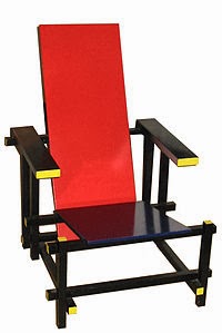
In 3D designs such as the Red and Blue Chair designed by Gerrit Rietveld in 1917,


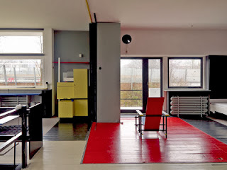
And later also in buildings such as the schröderhuis in Holland in 1924, which was an extension of what had started. The cube was the underlying form for architecture. While the surrounding houses are a block of bricks with dull colours, this was on the other hand was about bringing the outside to the inside. This was done by openness which let in more light.  Gerrit Rietveld also came up with the idea of constructing bigger rooms which can be transformed into smaller rooms by making use of partitions. He also made use of columns inside the house and walls made of glass, which was completely innovative at the time. In the interior we can also see experimental work such as the zigzag chair. There is lack of ornament, a sense of dynamism is created by the use of strong lines and the use of geometric formal vocabulary. 


Both found in the house.

All this was influential to the Modernist Movement. In the meantime in Italy, Filippo Tommaso Marinetti was founding the Futurist Movement. It was all about technology and the dynamic aspect of the modern life. It was founded to reject harmony and order as well as the museum-minded approach to the culture of the past. Its purpose was to embrace the modern technology namely speed, the machine and war.


Marinetti spread the idea that architecture challenges the idea that buildings should refer to history. Similarly, futurists following that type had to follow convention so experimented with new forms. For the Futurists, the new type was a way to emphasise the force of the expressive words. Important artists of this movement were Umberto Boccioni, Carlo Carra and Giacomo Balla.

Unique Forms of Continuity in Space, 1913 by Umberto Boccioni and François-Raoul Larche

These two pictures are an example to show the difference between, a Futurist statue to that of the Art Nouveau movement. It can be clearly seen that the excess of detail is removed completely, instead of the flowing, soft curves seen in Larche’s, in Umberto’s statue we get more angular, harsh lines. The delicate female form is replaced with a bulky almost grotesque figure while the realistic form is replaced by a more abstract figure.

We also have Carlo Carrà who is looking to the Cubist movement and the works of Picasso.


Woman on the Balcony, 1912 in comparison with Pablo Picasso’s Le Guitarist 1910.

We also have Giacomo Balla, in whose paintings he gives the impression of speed and fast movement due to the repetition of certain aspects or elements in his works.

Dynamism of a Dog on a Leash, 1912.

Charlotte Jirousek. 1995. Art, Design and Visual thinking: De Stijl. [online] Available at: http://char.txa.cornell.edu/art/decart/destijl/decstijl.htm [Accessed on 15th November 2013]

Lisa Tatcher. July 2012. Piet Mondrian – Line over Form.[online] Available at: http://lisathatcher.wordpress.com/2012/07/01/piet-mondrian-line-over-form/ [Accessed on 15th November 2013]

RGC. UN. 107.[online] Available at: http://itsfoolsgold.com/  [Accessed on 15th November 2013]

The White Stripes. June 2000. De Stijl. [online] Available at: http://www.last.fm/music/The+White+Stripes/De+Stijl  [Accessed on 15th November 2013]
Wickipedia. Red and Blue Chair. [online] Available at: http://en.wikipedia.org/wiki/De_Stijl  [Accessed on 15th November 2013]

Tomáš Petermann. July 2007. Utrecht (Haus Schröder/Rietveld) [online] Available at: http://www.panoramio.com/photo/3433076  [Accessed on 15th November 2013]
Carlos Zeballos. May 2013. GERRIT RIETVELD: SCHRÖDER HOUSE [online] Available at: http://architecturalmoleskine.blogspot.com/2013/05/gerrit-rietveld-schroder-house.html  [Accessed on 15th November 2013]


Vallecchi Casa editriche. Vallecchi un sognio lungo un secolo: Futurismo Manifesto. [online] Available at:  http://www.vallecchi.it/portali/37/bs/futurismomanifesto.html [Accessed on 15th November 2013]

Wikipedia. Picture: Unique Forms of Continuity in Space, 1913. [online] Available at: http://en.wikipedia.org/wiki/Umberto_Boccioni [Accessed on 15th November 2013]

UN. 2013. Macklowe Gallary: François-Raoul Larche [online] Available at: http://www.macklowegallery.com/education.asp/art+nouveau/Artist+Biographies/antiques/Decorative+Artists/education/Fran%26%23231%3Bois-Raoul+Larche+/id/153  [Accessed on 15th November 2013]

Joshsievgallery. UN. Gallery Project. [online] Available at: http://galleryproject.wiki.hhh.k12.ny.us/joshsievgallery  [Accessed on 15th November 2013]

Art Snapper Beta. May 2013. Giacomo Balla Adopts the Futurism Style. [online] Available at: http://artsnapper.com/giacomo-balla-adopts-the-futurism-style/#  [Accessed on 15th November 2013]