Sunday 26 January 2014

Essay: Eero Saarinen and Verner Panton

For my essay I wanted to talk about Eero Saarinen from the International Style and Verner Panton from Pop Art Design. The reason why I chose these two particular designers is because they both have made innovative discoveries which led to revolutionary designs, especially in the area of moulds.

The start for Eero Saarinen was to win the MoMA competition for the Organically Shaped Furniture in 1940 with Charles Eames, when they created the Organic Armchair together.


After the competition they both went their own separate ways and both made drastic developments in design. Saarinen then created the Grasshopper and Stool which was inspired by Alvar Aalto’s Paimio chair.


Saarinen still made use of wood bending but introduced more comfort to the chair by adding the cushioning which was already introduced in the Organic Armchair but, as was the wood bending, it too was improved. This improvement made the design look more stylish and comfortable which led Saarinen to look back at the Organic Armchair again and do further development to the design.

These developments lead to the creation of the Womb Chair in 1947-1948. Apart from good looks and great comfort, this chair also offers a sense of security to the person sitting in it thus he feels more relaxed. The design of this chair also offers a variety of informal ways for the body to occupy it. Saarinen realized that people did not want the rigidness of the Victorian age so he created something in which one could truly feel at ease.

He furthered his designs and started working on something innovative which, at the time was quite unheard of, that of having a chair made out of one piece. Moreover it was to have a single pedestal resembling a wine glass stem instead of the traditional four legs; same goes for the table. This creation was the famous The Tulip Chair. It was not entirely made out of plastic as Saarinen had wished for, but rather an equal combination of both plastic and metal. In fact he stated that he was “looking forward to the point when the plastics industry will be capable of manufacturing the chair using just one material, the way I have designed it.”


His wish came true years later thanks to the hard work and further research and development of Verner Panton. Panton had started his career as an apprentice to Arne Jacobsen where Panton had assisted in the creation of the Ant Chair.


On seeing his mentor’s works, Panton started to apply organic curves and bold colours to his designs too. This led to the creation of the Cone Chair in 1958 which later led to the idea of the Panton Chair in 1960. By now it was just an idea.


It took him almost a decade of research and countless experiments to come up with the finalised form of the iconic chair we now today as the Panton Chair or the ‘S’ Chair. It was made out of one whole piece of material which was considered immediately a sensation once it went public. This chair is still considered as a classic of modern furniture and is used by many in private homes as well as public buildings.


This could well be the start to Pop Art Design in which Panton’s role was to be the stepping stone and a way of transition from the Organic Style to Pop Art Design. In fact from this point Panton’s designs tend to be more playful and following trends such as psychedelic, the idea of living in a habitat pod and the plan of apartment sharing due to the hippy movement which later coined the term of “good bourgeois taste” for such designs.


What makes these two designers fascinating for me is the fact that although there is quite a time gap between Saarinen and Panton they also started their careers at different points but eventually converged and ended up working on the same idea. That idea was to manipulate materials such as plastics in such a way to create a particular design as whole by means of using moulds. Where one was limited, thanks to the passing of time and the improvement in technology the other could finish and make that original idea work and still is popular to this very day.

Eero Saarinen. 1956. Vitra Design Museum: Tulip Chair. [online] Available at: http://www.design-museum.de/en/collection/100-masterpieces/detailseiten/tulip-chair-no-151-saarinen.html  [Accessed on 18th January 2014]


[online] Available at: http://theredlist.fr/wiki-2-18-393-1390-view-pop-design-profile-panton-verner-4.html [Accessed on 18th January 2014]

Evad. May 2009. Colour Lovers: The Colours of Verner Panton. [online] Available at: http://www.colourlovers.com/home/blog/2009/05/18/the-colors-of-verner-panton [Accessed on 18th January 2014]

International Style: Eero Saarinen

For Group Work we had to carry out a visual presentation about a chosen topic from the units we studied in class. Our group chose The International Style and my part was to research and discuss Eero Saarinen's works.

Eero Saarinen, together with Charles Eames, started by creating the Organic Armchair, in 1940, for the Organically Shaped Furniture competition for MoMA. 


Saarinen then created the 61U better known as the Grasshopper Chair and Stool which is reminiscent to Alvar Aalto’s Paimio Chair of 1931.


Later he then developed the Organic Armchair design to create the Womb Chair in 1947-1948. It was still following the features of the previous chair but he had improved both the looks as well as comfort. It also offers a sense of security therefore one is more relaxed when sitting in this chair.  He created a chair that provides a variety of informal ways for the body to occupy it. This was Saarinen’s way to say “that modern furniture can indeed be comfortable and welcoming without losing its contemporary edge.” This is because “people sit differently today than in the Victorian Era.”   (Pierluigi Serraino. Eero Saarinen. Page 25)


Saarinen made further development in a series of furniture designs along his career and The Tulip Chair, 1956, is an example of an interrupted form to fulfil basic functions to the human body. He states that he “wanted to make the chair all one thing again”. It was something new to have a chair constructed as a whole piece let alone to have one support point instead of the traditional four legs. It has a central supporting stem “like a wine glass” which is kept uniform for both chair and table. This design was still considered as organic design but it was also approaching the Pop Art Design culture. The Tulip Chair was not entirely done from plastic; it was an equal combination of plastic and metal. Saarinen states that he is “looking forward to the point when the plastics industry will be capable of manufacturing the chair using just one material, the way I have designed it.”


When talking about International Style one cannot leave out the influence of architecture, and Saarinen is also famous for his architecture apart from his furniture designs.
Irwin Miller house 1953-1957 (left);   Falling Waters by Frank Lloyd Wright (right)


When comparing the two buildings they both consist of geometric forms but in the case of Wright's, it seems more organic due to the fact that it blends more to its surroundings since he used the same materials. In the case of Saarinen he introduced the white. Another similarity is that they both have spacious living rooms and they both have a particular feature. In the case of Falling Waters is the fireplace in the middle of the room, as for the Irwin Miller House it is the sunk-in sofa. This also enhances the spaciousness since there are fewer obstacles in the way. Both houses have large windows so that the occupant feels at one with nature and have more natural light into the house. To this regards the Irwin Miller House appears to be more lit since it has complete walls of glass and the white walls reflect more light.

Eero Saarinen. 1956. Vitra Design Museum: Tulip Chair. [online] Available at: http://www.design-museum.de/en/collection/100-masterpieces/detailseiten/tulip-chair-no-151-saarinen.html  [Accessed on 6th January 2014]

Designs Today ... Found Locally

Once that you start going in depth and studying a particular subject, like I am doing through these blogs, I found that I started noticing such designs everywhere I look. So this time, I noted down the places in which I saw famous and classic designs and took photos where it was possible. It is amazing how unnoticed certain things go but once you start to look around you and actually appreciate your surroundings you see things that you never noticed before due to the rushed lives we live in today.

Such an example could be seen at Water Biscuit in St Julian’s Paceville. They do not have the actual chairs but more of an inspiration from Ray and Charles Eames’ Wire Mesh Chairs. I don’t imagine having the originals standing out in the street in such a place but the link is visible.

Eames Mesh Chair and Chairs at Water Biscuit

Another example could be seen at the Sliema Sea Front McDonald’s where they actually have the original replicas of Eames’ works. I think it is nice to incorporate such designs in such a highly visited place because, after all, it is part of everyone’s culture. If said designers, and others to follow, were not so innovative we would not be living in the world we know it today. So in this way we pay homage to their geniality.


As for the place where one can actually buy such classical and stylish designs, I found locally that Camilleri Paris Mode does. I could not go round the shop taking photos, even because such furniture would be secured in the stores and would not be taking it out just for a picture. So instead I raided their website and found even more iconic designs there. So there I found:


Ray and Charles Eames Lounge Chair


Verner Panton Tulip Chair and Table


Philippe Starck Ghost Chair


Camilleri Paris Mode. [online] Available at: http://www.camilleriparismode.com/ [Accessed on 15th January 2014]

Saturday 25 January 2014

Putting the Chart Together

All that I have discussed in the previous five blogs, now, has to be communicated visually. Each section is contains the designers’ works, how they got inspired, in context with historical facts together with whom they inspired in turn. I tried to use popular photos with regards to historical facts so that it would not be too hard for whoever sees it to decipher the context thus understand the meaning behind it.


Next was to add the conflicting designers. This time their section is more about their designs rather than following historical facts since the world had calmed down from going through extreme changes. What was happening during this time was not particularly affecting the designers’ works.


At times we look at designers’ works thinking that they are just results of research or artistic expression. We tend to overlook the importance and impact historical and political events shape artists’ works.

Chart Concept 5


For my final designer I wanted to finish off with Richard Meier in my chart. What intrigued me about this designer is the fact that he has various aspects of design and not all his works follow the same style or ideas. For instance, his works which were produced for Alessi were more concerned about looks and decoration rather than functionality. On the other hand his furniture looks more like his architectures in their geometric forms. They are quite plain with no excessive detail, functional and also show craftsmanship. When looking at Richard Meier’s collection for Strada I can’t help but bring to mind Charles Rennie Mackintosh’s works. 

Collection for Strada resembling the works of Charles Rennie Mackintosh.
 
But here what I will discuss is Meier’s designs he created for Alessi. For instance his Hanukkah  Menorah is technically a candle holder but in their abstract architecture represents significant moments in the Jewish history.


Another reason why I chose this designer in particular (even though there were many designers for Alessi) is because Meier was also influenced by Marcel Breuer  (apart from the greater influence from Le Corbusier) which with regards to my chart concept it closes the circle and we are back to the start. Thus the concept of this cart apart from showing the contrast in designs it is also to show that designers have different aspects HOW they design. So technically what was lost from the “Good Design” era was found again even though in between we have periods such as Radical and Anti Design we still get people to look back at the good generated by periods such as Bauhaus and International/Organic Styles.

1980s Knoll Arm Chair 810
1984/1985 Piazza Tea and Coffee service
Richard Meier Open Cube Glass Top Low Table

Alessi. Catalogue – Richard Meier. [online] Available at: http://www.alessi.com/en/1/88/richard-meier [Accessed on 18th January 2014]

Strada B.V. NA. Strada - The Richard Meier Collection for Strada  [online] Available at: http://www.stradaproject.com/ [Accessed on 18th January 2014]

Krysten Pressel. NA. Richard Meier [online] Available at: http://www.silvercreek.wclark.k12.in.us/studentwork/architects/rMeier/index.htm [Accessed on 18th January 2014]

De zeen magazine. November 2011. Hanukkah menorah by Richard Meier [online] Available at: http://www.dezeen.com/2010/11/11/hanukkah-menorah-by-richard-meier/ [Accessed on 18th January 2014]

Len Small. November 2010. The Scroll tablet magazine on the News – Mezuzah Pop: The Jewish Museum unveils a line of Judaica including new designs by Richard Meier. [online] Available at: http://www.tabletmag.com/scroll/49934/mezuzah-pop [Accessed on 18th January 2014] 

Chart Concept 4

In my previous posts I wanted to show the element of good, functional design by artists like Marcel Breuer, Ray and Charles Eames and Verner Panton. Now I want to compare them with artists like Ettore Sottsass and Richard Meier.


To start off, my next part of the chart will be about Ettore Sottsass. He was an initiator in the revolution against the “rigid functionality” of design that was present before and after the Second World War. He instigated vitality through his vivid colours and in the use of sharp lines. Together with the Memphis Group, Sottsass wanted to break down the boundaries between high and low classes, which to some, meant freedom.

At this point designers had kind of lost the advancements achieved by previous designers; as long as it was popular and mass produced they were happy about it. They started going after overly decorative designs again but this time they were more decorative and less functional than the ones created during Art Deco. The designs were starting to be very colourful and were starting to have designs which were elevated to the level of an artwork.

The reason why I chose this designer is because I wanted to bring out the contrast with the previous artists. No more of the ideal that “less is more”, now it was of the idea that “less is a bore”, thus the bombastic new creations. In his creations Sottsass makes use of random things and shapes that clash between them.

A scientific discovery such as the Hole in the Ozone Layer, led to a domino effect to everyday things we do today. It created mass awareness of the damage of industry inflicting on climate. This pushed designers and architects to rethink materials being used in their works; and a shift towards recyclable and eco friendly materials exploded. We start seeing cardboard furniture, recycled plastic bottles and scrap metal being incorporated in designs. This led to further awareness regarding sustainability which is still being felt today.

Later I was doing some further research to find out who might have been influenced by Ettore Sottsass and found this article by Diana Marian Murek, in which she writes that Balenciaga might have been inspired by said designer. In fact she states that “The porcelain lamp ASHOKA by Ettore Sottsass from 1981 [left] might have been the inspiration for the multicolour, block stripes dress by Balenciaga [right].”

Dior's Autumn/Winter 2011-12 Haute Couture was actually inspired by the whole Memphis group designers, but for the sake of the concept I am following I will post the one with regards to Ettore Sottsass.


1979 drawing of bookshelf
1980 Rubik’s cube popular / Pac-Man released / john Lennon assassinated (re-pop the beatles and people back to love and peace)
1981 personal computers/ royal wedding on tv set trend to fashion
1981 beverly
1981 ashoka lamp
1981 Carlton cabinet for Memphis
1981 Casablanca
1982 malabar
1983 westside lounge
1985 Hole in the Ozone Layer Discovered
1985 ‘tartar’ consolle
1986 Chernobyl
1986 Clesitera e maia
1986 Hollywood series ceramic vases
1987 New York Stock Exchange Suffers Huge Drop on "Black Monday" (a repeat of great dipression but not as big – people go back to lack of spending)
1987 Max Shelve
1989 Berlin Wall falls


Alessi. NA. Ettore Sotsass.[online] Available at: http://www.alessi.com/en/1/122/ettore-sottsass[Accessed on 16th January 2014]

A.Davies. Design Technology Department: Ettore Sottsass. [online] Available at: http://www.design-technology.org/ettoresottsass.htm  [Accessed on 16th January 2014]

Diana Marian Murek. May 2010. Into the Fashion … then is now: INSPIRATION Ettore Sottsass 1981... BALENCIAGA FW 2010/11 [online] Available at: http://www.intothefashion.com/2010/05/inspiration-ettore-sottsass-1981.html [Accessed on 16th January 2014]

Vitra Design Museum. [online] Available at: http://www.design-museum.de/en/collection/100-masterpieces/detailseiten/carlton-ettore-sottsass-jr.html [Accessed on 16th January 2014]


Design Museum. MEMPHIS - Product + Furniture Designers (1981-1985). Design Museum Collection [online] Available at: http://designmuseum.org/design/memphis [Accessed on 16th January 2014]

Chart Concept 3

Another artist I wanted to include in my chart is Vernon Panton. Although he was active during the Pop Art Design era he still had good functional designs with a hint of playfulness. He began as an apprentice with Arne Jacobsen and was assigned to assist the master (Jacobsen) on the iconic Ant Chair.


Verner Panton was influenced by Jacobsen’s organic modern approach, such as the Swan and Egg Chairs.

These two stylish chairs are the Swan and Egg Chairs 1957-1958 by Arne Jacobsen which were created as a whole with the Arne Jacobsen Royal Hotel Copenhagen 1956-1960.

Panton’s furniture was based on extravagant geometric forms and the use of strong colours as seen in his Cone Chair (1958) along with the Panton Chair which was designed in 1960 but not produced until 1967 due to its technical challenges. It was a time where plastics were being discovered and there was a continuation in the potential of moulds. Panton’s revolutionary ideas and designs were to blend the two together thus creating his iconic designs, which are still popular and used by many to this day.

 
Cone Chair 1958 by Verner Panton. Panton Chair 1960 – 1967.

Although Panton’s work was made during the Pop Art Design era he still had good design throughout his works. His designs did, eventually, become more ornamental along the way but still kept their functionality. During the late 60’s he went on a more psychedelic aspect in his designs  and with the inspiration from the “man on the moon” thing he was designing more confined spaces.

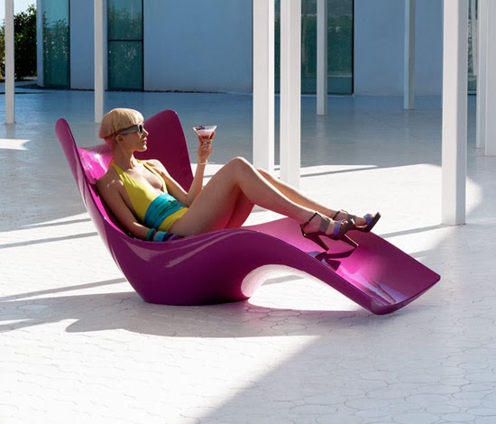
From looking at today’s designers, such as Karim Rashid I think that he draws inspiration from artists such as Verner Panton in his designs. Such examples can be seen in:
1970 Hukla Chair by Verner Panton
And
2010 Surf Sun Lounger by Karim Rashid


1971 Kleeblatt sofa by Verner Panton
And
21st century Omni Sofa by Karim Rashid

1951 coloured tv introduced
1952 the Ant chair
1955 McDonalds founded
1956 grace Kelly marries prince Rainer III of Monaco / Velcro introduced
1958 hula hoops became popular / peace symbol created
1958 Verner Panton Cone Chair
1958 Swan and Egg Chair by Arne Jacobsene
1959 C1 Chair and Stool

1960 lasers invented
1960 Panton Chair Designed
1960 Peacock Chair
1961 Berlin wall built / JFK Gives "Man on the Moon" Speech
1962 Andy Warhol Exhibits His Campbell's Soup Can / Marilyn Monroe Found Dead
1963 JFK assassinated
1964 Beatles become popular in U.S.
1965 The Rolling Stones’ Mega Hit Song, “(I Can’t Get No) Satisfaction” / U.S. Sends Troops to Vietnam
1967 Panton Chair produced
1969 Neil Armstrong Becomes the First Man on the Moon / Rock-and-Roll Concert at Woodstock

1970 Amoebe Highback (l ahmar bill curve)
1970 Hukla Chair (il vjola)
1973 Two Level Seat
1974 Sitting Wheel
1974 Relaxer Chair


Evad. May 2009. Colour Lovers: The Colours of Verner Panton. [online] Available at: http://www.colourlovers.com/home/blog/2009/05/18/the-colors-of-verner-panton [Accessed on 7th January 2014]